UX Designer CV Templates
Research insights, Figma craft and accessibility choices tell a stronger UX story than tool logos alone. Senior, lead, product, UI/UX, research, interaction, service and junior designer templates mirror UK product teams. Rewrite your case studies into the samples.
Our users have secured roles at




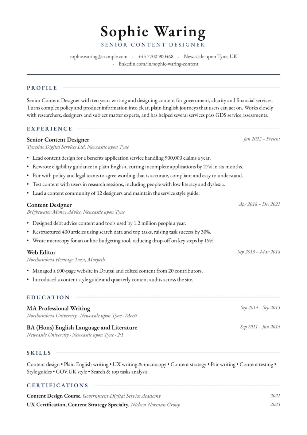
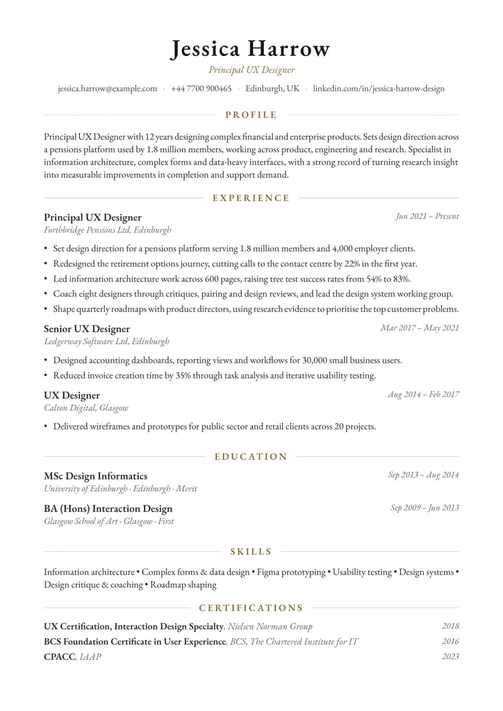
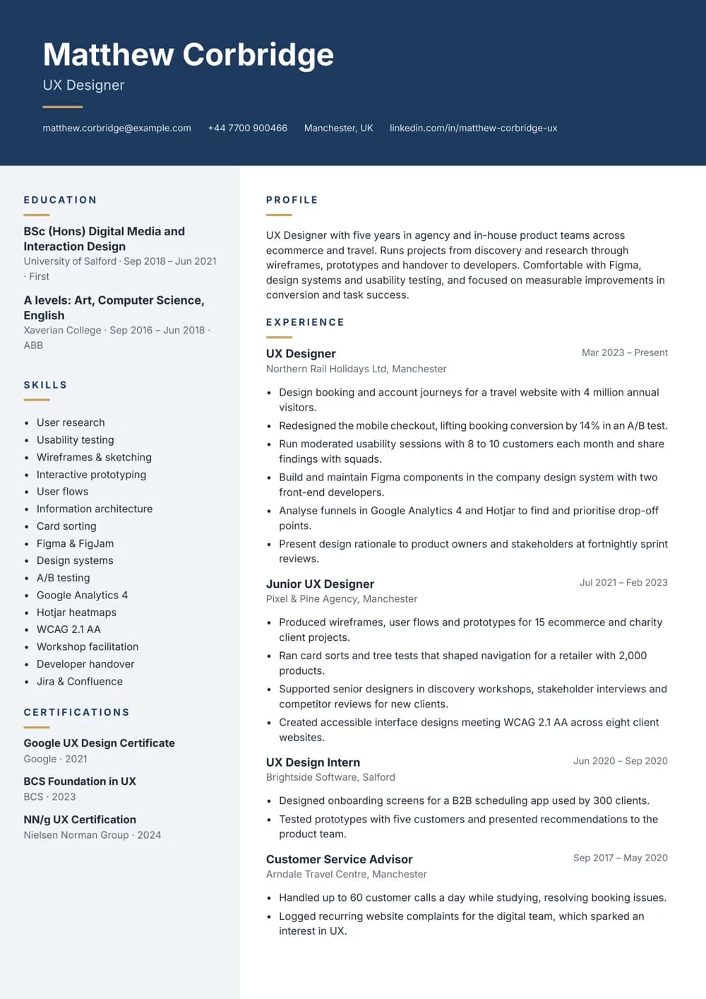
Content Designer
Garamond with deep-blue accents and a ruled header. Suits experienced content designers and UX writers.
Mid-weight UX Designer
Navy header with a tinted sidebar for tools and skills. Suits mid-weight UX designers with growing portfolios.
Principal UX Designer
Centred Garamond header in antique gold. Suits principal designers shaping complex products and services.
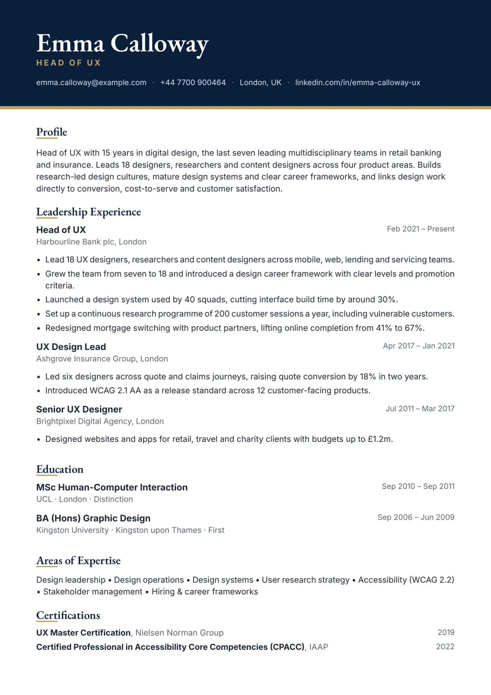
Head of UX
Navy header with a Garamond name and gold rule. Built for design leaders running UX teams.
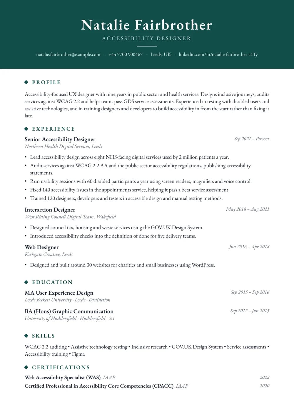
Accessibility Designer
Deep teal banner with a centred serif name. Suits designers specialising in accessible and inclusive services.
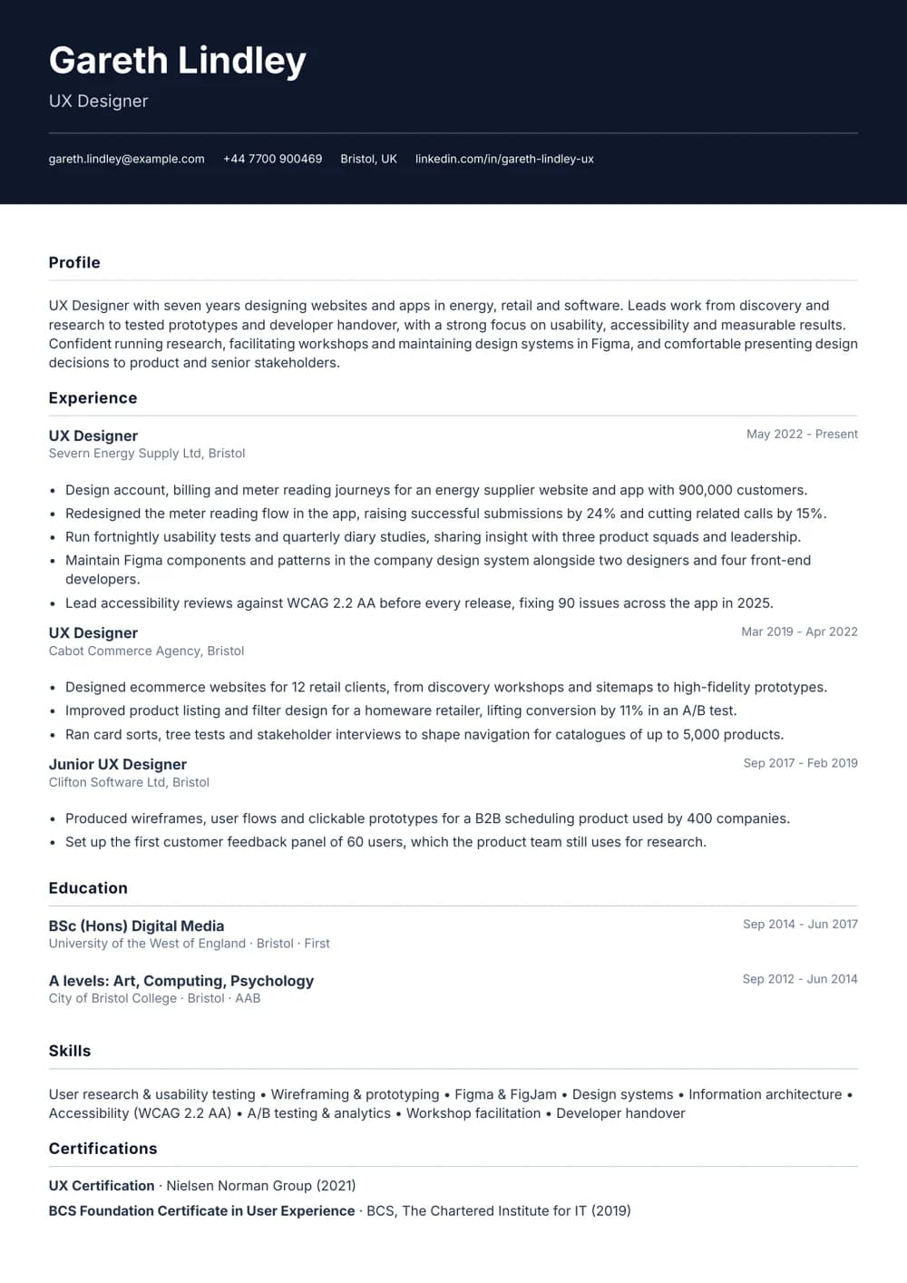
UX Designer
Navy header over a clean single column. Suits UX designers with a steady record in product teams.
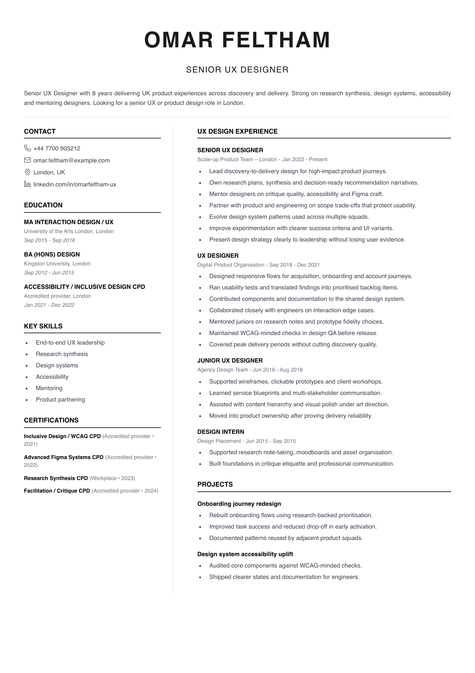
Senior UX Designer
Built for senior delivery. Highlights research synthesis, design systems, accessibility and mentoring.
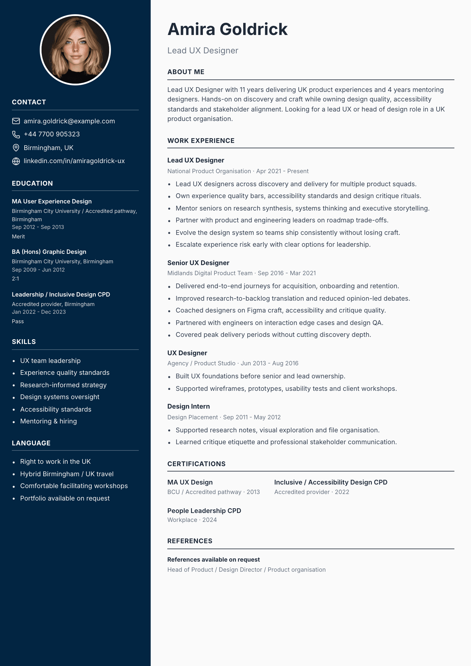
Lead UX Designer
For experienced leads. Team leadership, experience quality, design systems and stakeholder alignment.
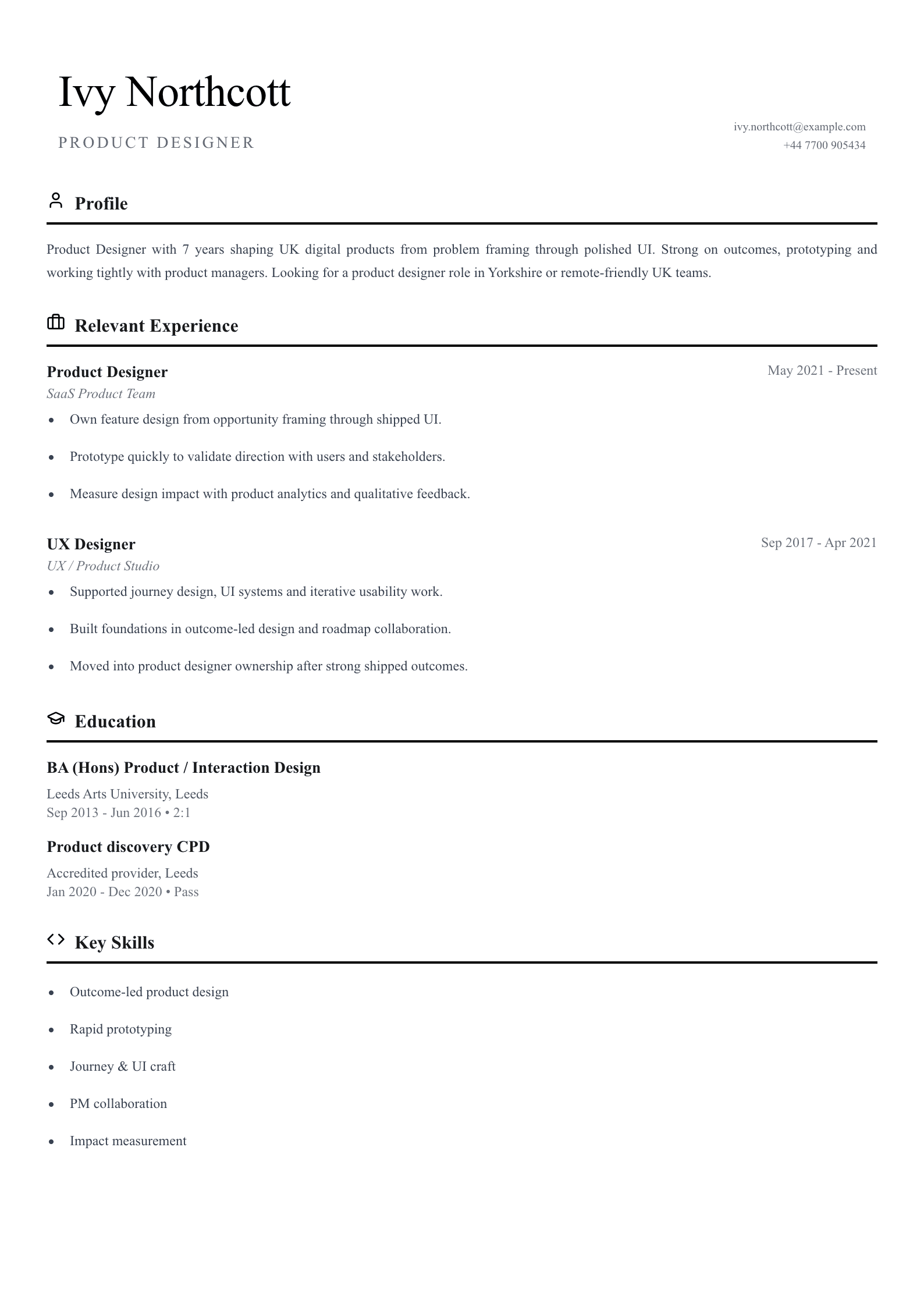
Product Designer
Outcome-led product design from framing through polished UI and impact measurement.
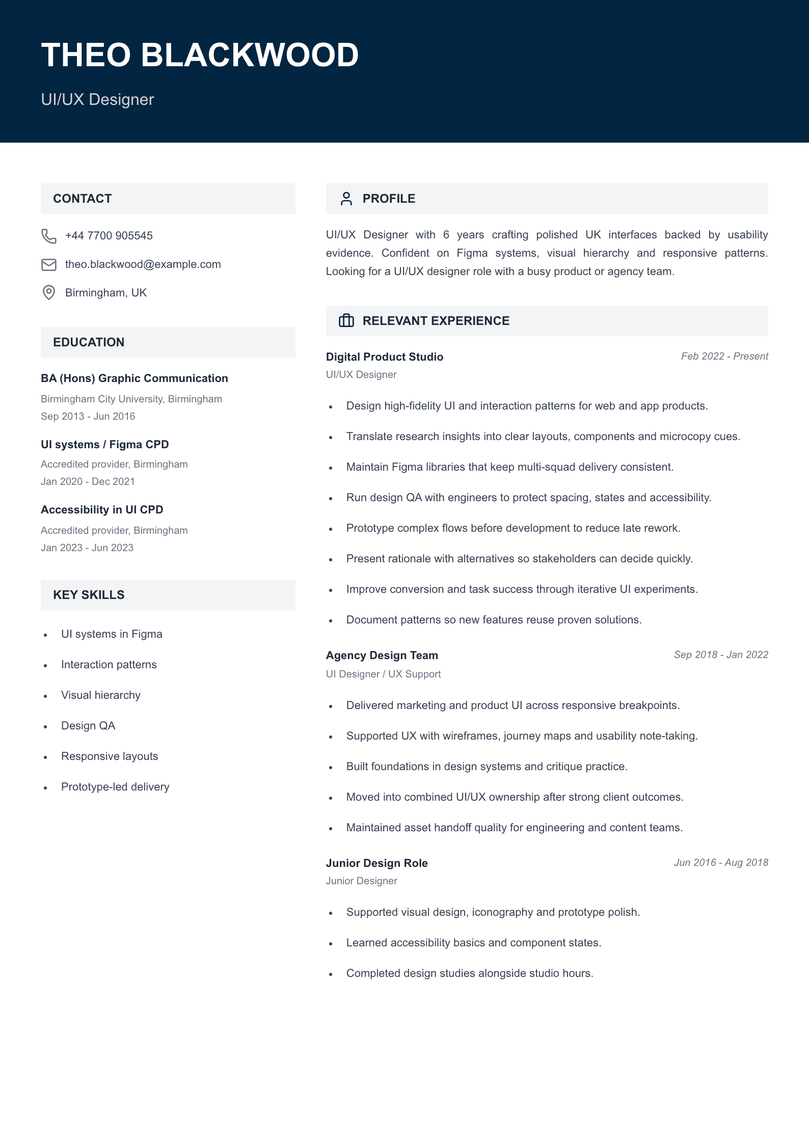
UI/UX Designer
High-fidelity UI systems, interaction patterns, design QA and responsive layouts.
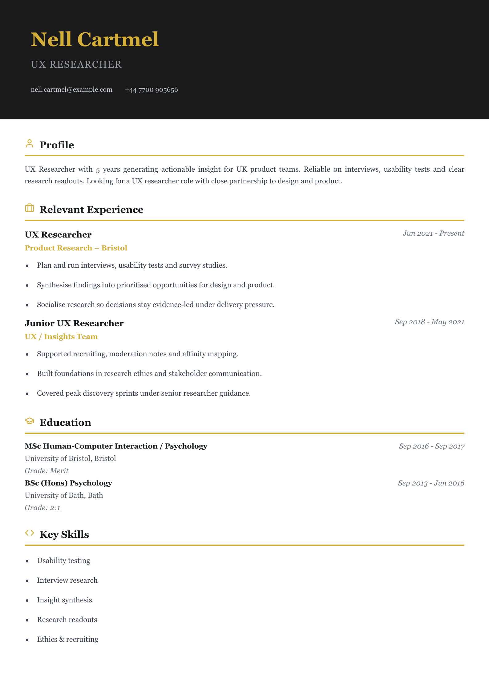
UX Researcher
Leaner layout for interviews, usability tests and actionable research readouts.
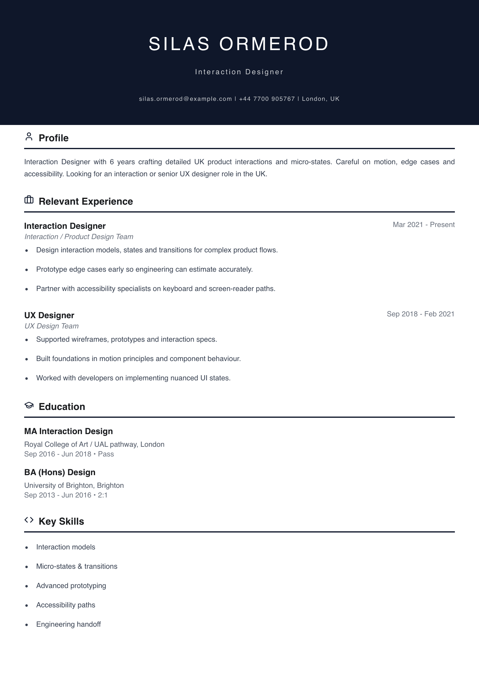
Interaction Designer
Detailed interaction models, micro-states, transitions and accessibility paths.
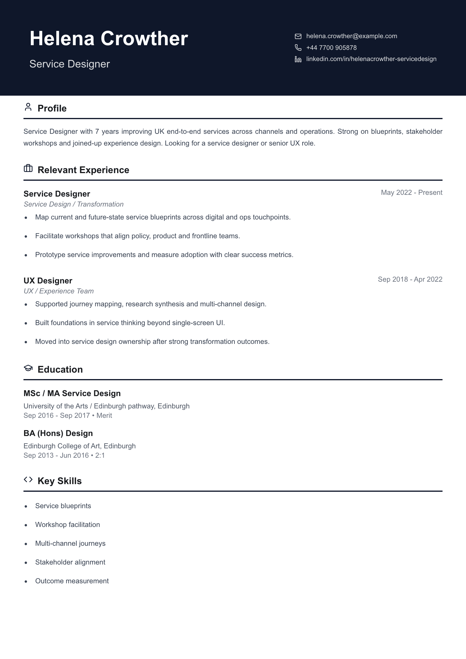
Service Designer
End-to-end service blueprints, workshops and multi-channel journey design.
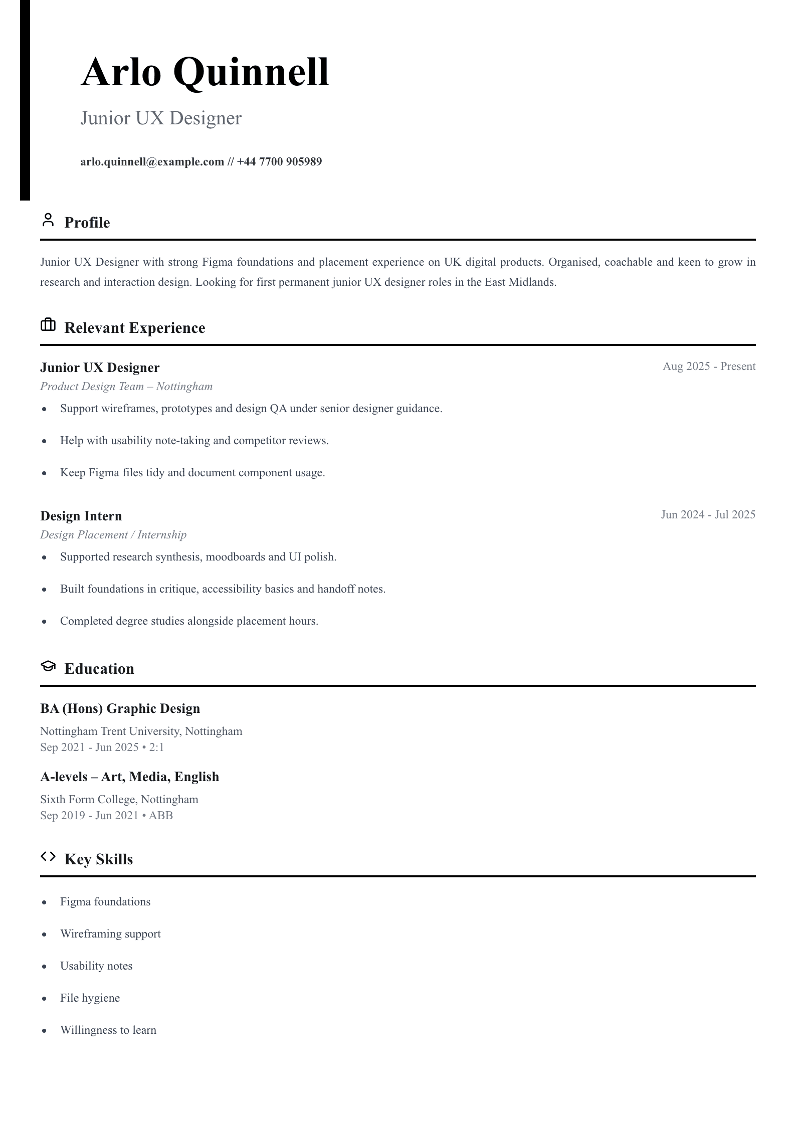
Junior UX Designer
First-role template framed from placement and degree study into junior UX roles.